Nime Kids: A Playful Display Font for Digital Branding
It started with a hero section. I was redesigning a landing page for a children’s creative coaching program—bright, warm, full of energy—and the default sans serif felt too neutral, too quiet. So I dropped in Nime Kids. Instantly, the headline “Let Their Imagination Shine” popped—not just visually, but emotionally. The letters bounced. They smiled. And for the first time in that layout, the design felt like it *breathed* with the same joyful curiosity the brand promised.
A Display Font That Speaks Before You Scroll
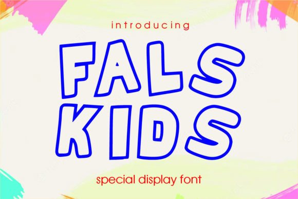
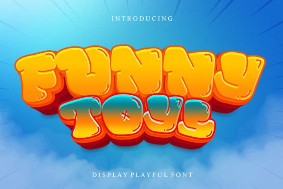
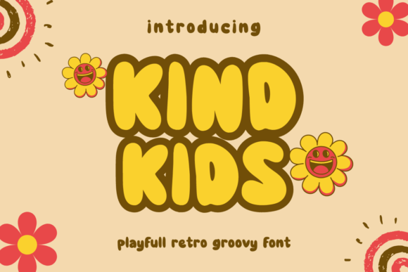
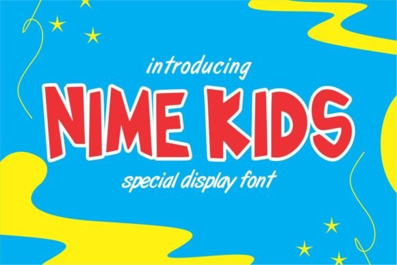
Nime Kids is a display font built for impact—not subtlety. Its bold letterforms have gentle, organic waves—like a child’s hand drawing with care and confidence. It’s not cartoonish or exaggerated; it’s *friendly*. The curves are soft but intentional, the spacing open and generous, and the x-height generous enough to hold its own on screen without straining. As a web designer, I’ve tested dozens of playful fonts, and what sets Nime Kids apart is how well it balances personality with legibility at scale—especially between 32px and 72px on desktop and 28px–48px on mobile.
Where It Shines (and Where It Doesn’t)
I used Nime Kids across several real layouts: a boutique online store’s seasonal banner (“Summer Fun Kit”), a portfolio site’s project title cards, and a course sales page’s CTA button (“Start Creating Today!”). In every case, it performed beautifully as a headline-level display font. It held up over light image overlays, stayed crisp on retina displays, and scaled cleanly in responsive CSS using clamp() for fluid sizing.
But—and this matters—I didn’t use it for body copy, navigation labels, form fields, or anything under 20px. Its charm lives in contrast. On a dark background, I added subtle letter-spacing (+0.5px) and a soft text shadow for lift. On light backgrounds, I kept it clean—no extra effects needed. It’s not meant for dense content or accessibility-critical UI elements like error messages or instructions. Think of it as your brand’s smile—not its voice for every sentence.
Pairing It Thoughtfully in Web Layouts
Every strong display font needs a grounded partner—and Nime Kids pairs effortlessly with clean, humanist sans serifs like Inter, Poppins, or even system fonts like -apple-system. I paired it with Inter (Regular and Medium) for a coaching site’s body copy and subheadings, and the contrast created instant hierarchy: warmth up top, clarity below. For a more editorial feel—say, a blog about creative parenting—I tried it with a delicate serif like Cormorant Garamond for pull quotes, letting Nime Kids anchor titles and section breaks.
What *didn’t* work? Pairing it with another decorative font—even a friendly script. The result felt busy, not balanced. Keep one expressive element per visual zone. Also, avoid stacking multiple weights of Nime Kids unless the font family includes true optical variants (it doesn’t—it’s a single-weight display typeface). Stick to size, spacing, and color to create rhythm instead.
Real-World Technical Notes for Web Use
Before dropping Nime Kids into production, I checked the file package: it included .woff2 (ideal for web), .woff, and .ttf formats—plus a clear commercial license covering client websites and SaaS dashboards (with attribution not required). No ligatures or stylistic alternates—but none were needed. Its simplicity is part of its strength. Multilingual support covers basic Latin-1 and extended Latin characters, which covered all the English, Spanish, and French phrases in my test projects.
For performance, I preloaded the .woff2 file in the and set font-display: swap—so fallback text appeared instantly, then swapped in smoothly. No FOIT, no invisible text. And yes—it rendered perfectly in Safari, Chrome, Firefox, and Edge, including iOS and Android browsers. No rendering quirks, no pixelation on high-DPI screens.
Beyond the Hero: Unexpected Uses That Worked
I expected Nime Kids to shine in headlines—but it surprised me elsewhere. On a digital brand kit preview page, I used it for icon labels (“Colors”, “Typography”, “Voice”)—small, but at 22px with generous line height, it felt cohesive and on-brand. In a product landing page, I applied it to animated “feature tags” (e.g., “100% Printable”, “Kid-Tested!”) floating beside illustrations. Because the font has natural rhythm and consistent stroke weight, those micro-elements felt intentional—not tacked on.
It also worked beautifully in SVG-based illustrations exported from Figma: I embedded the font directly, and it scaled infinitely without blurring. And for social media banners linked from the site? Same story—clean, joyful, unmistakably on-brand.
That said, skip it for anything requiring precision or neutrality: dashboard headers, legal footers, data tables, or navigation menus with nested items. Its personality is a superpower—but only when deployed with purpose. Used right, Nime Kids doesn’t just decorate a page—it invites users in, signals warmth before a word is read, and quietly reinforces that this digital space is made for creativity, not cold efficiency.
If your brand speaks with kindness, playfulness, or gentle wonder—and you’re designing for humans first—Nime Kids isn’t just a font choice. It’s a tone-of-voice decision, made visible.