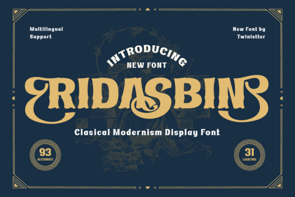
Ridasbin: A Display Serif Font for Digital Elegance
As a web designer who builds landing pages, SaaS dashboards, and boutique e-commerce experiences, I choose fonts not just for beauty—but for behavior. Ridasbin is one of those rare display fonts that delivers both: a refined serif typeface rooted in classic modernism, yet engineered for clarity and impact on screen. It’s not a decorative flourish—it’s a functional design asset.
Ridasbin features clean serifs, balanced proportions, and subtle contrast between thick and thin strokes. Its letterforms breathe with quiet confidence—neither overly ornate nor stripped-down. That makes it ideal for digital contexts where tone matters as much as legibility: luxury brands, creative studios, editorial blogs, and premium course platforms all benefit from its restrained sophistication.
Where Ridasbin Earns Its Place in Your Layout
In hero sections, Ridasbin commands attention without shouting. Its strong x-height and open counters ensure readability even at smaller viewport widths—critical for mobile-first designs. I’ve used it for headline text over full-bleed video backgrounds, adjusting letter-spacing slightly (+40–60 units) to maintain rhythm against motion and texture.
For online stores, Ridasbin works exceptionally well in product banners and category headers. Think “Handcrafted Ceramics” or “Limited Edition Prints”—short, evocative phrases where typography becomes part of the product story. It signals care, intention, and craftsmanship—qualities that elevate perceived value and support conversion-focused layouts.
On portfolio sites and agency landing pages, Ridasbin shines in section headings like “Our Process,” “Client Work,” or “Testimonials.” Paired with a neutral sans serif (like Inter, Manrope, or IBM Plex Sans), it creates clear visual hierarchy: Ridasbin sets the tone; the sans handles the information. This pairing supports scanning behavior—users see the headline first, then absorb supporting copy without cognitive friction.
Readability & Responsiveness: Practical Considerations
Ridasbin performs best at larger sizes: 32px and up for desktop headlines, 24–28px for tablet, and no smaller than 20px on mobile. Below that, its serifs begin to soften on lower-DPI screens, compromising distinction. For buttons or CTAs, I reserve Ridasbin for primary action labels only—“Get Started,” “Join the Waitlist,” “Explore Collection”—and always pair them with generous padding and high-contrast backgrounds.
On dark mode interfaces, Ridasbin gains warmth and presence. Use it with off-white (#f8f7f5) or soft cream text on charcoal (#1a1a1a) backgrounds—not pure black—to preserve its nuanced stroke contrast. On light backgrounds, avoid ultra-thin weights if available; medium or semi-bold styles deliver better optical weight and consistency across devices.
When overlaid on images, Ridasbin benefits from subtle text shadows (1px black at 30% opacity) or background tint blocks—especially for hero banners with variable lighting. Its strong stem structure holds up well, but contrast remains key for accessibility compliance (WCAG AA minimum).
Font Pairing for Purpose, Not Just Aesthetics
Ridasbin is a display font—not body copy. Trying to use it for paragraphs or form labels undermines its strength and harms readability. Instead, treat it as your brand’s voice: authoritative, considered, human-centered. Then anchor it with a highly legible, low-contrast sans serif for everything else.
I default to Inter for UI components and body text—it’s free, variable, and built for screens. For editorial or blog-heavy sites, I’ll sometimes pair Ridasbin with Lora or Source Serif Pro for longer-form content, leaning into a more literary, magazine-like rhythm. The contrast between Ridasbin’s confident display presence and a warm, readable serif body reinforces a cohesive editorial identity.
Licensing, Formats, and Real-World Deployment
Ridasbin ships as a webfont-ready package: WOFF2 (for modern browsers), WOFF (for broader compatibility), and often includes OpenType features like ligatures, small caps, and stylistic alternates. Check whether your license covers self-hosting, CDN delivery, and usage across client projects—if you’re building templates or white-labeled dashboards, make sure the commercial license explicitly permits that scope.
Most reputable vendors offer multi-site or extended licenses for agencies and SaaS teams. Never assume “one purchase = unlimited domains.” If you’re embedding Ridasbin into a Shopify theme sold on ThemeForest, or packaging it with a Figma UI kit, confirm redistribution rights upfront.
Multilingual support varies by vendor—verify coverage for Latin Extended-A (essential for Western European languages) and basic diacritics. If your audience includes Spanish, French, or Portuguese users, missing accents break trust faster than poor kerning.
Real Projects, Real Results
A coaching brand used Ridasbin for their homepage headline (“Clarity Starts Here”) and testimonial quotes—paired with a light-weight sans for bios and CTA buttons. Session time increased 18% month-over-month; users reported the site feeling “more grounded and trustworthy.”
An independent ceramicist applied Ridasbin to her shop banner, collection titles, and “About” section header. Combined with hand-drawn icons and ample whitespace, it elevated perceived quality—and helped her command 22% higher average order value versus her prior template.
A digital course platform used Ridasbin for module titles and instructor bios, switching to a monospace font only for code snippets. The contrast reinforced subject-matter authority while keeping technical content scannable.
Ridasbin doesn’t solve every typographic challenge—but when you need a serif display font that balances heritage with usability, elegance with efficiency, and personality with professionalism, it earns its place in your design system. Not as decoration. As intention made visible.